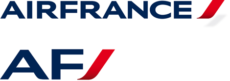
A new logo to accompany Air France in shifting the emphasis from its status as the world's leading air carrier to that of a global brand.
By merging the words «AIR» and «FRANCE», the company asserts its international status while preserving its traditional values, and thus becomes a true Brand. This new logo has become the signature for Air France's new ambitions. Despite still being officially referred to as "Air France" in two words, the logo is set as one word. Its saving grace is that the typography is quite handsome and alone worth the upgrade.
Operating since 1933, Air France has become one of the biggest and most recognized airlines in the world, traveling to nearly 100 countries. A new identity, replacing its last update since 1975, has been designed by Brandimage.


For the first time Air France integrates a monogram in its identity system. Powerful and lively the red accent is both a graphic and architectural sign.
The new logo highlights Air France's desire for excellence and echoes the airlines's position as leader in international air travel.
The exclusive typography Brandimage designed for Air France with light and elegant lettering combines with a dynamic red accent to underscore Air France's dedication to serving its clients at the best.

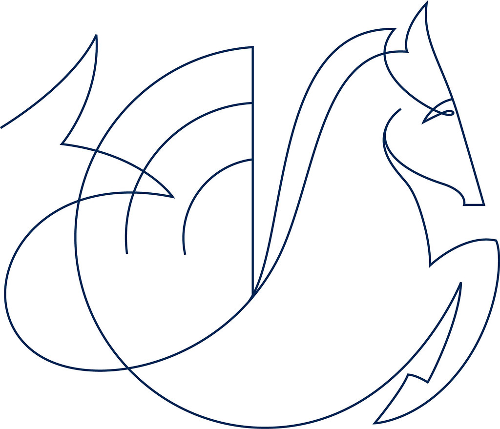
When Air France was formed in 1933 from the merger of various airlines, it adopted the logo of Air Orient, a hippocampe ailé (winged sea-horse), which has served as the icon for Air France and its parent company on and off through the years. I'm not entirely sure what role this latest iteration plays in the identity, but it sure is beautifully crafted.

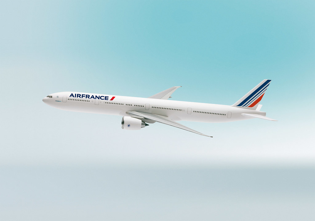
Refined lines with a slight curve jazz up the tricolor flag on the aircrat's tail. Overall, a nice, elegant update.


2 commentaires:
Air france de logo novo pede foto nova no blog.
Abraço
Rafael
Assim que for lançado o novo livery nos aviões eu mudarei o header logo.
Obrigado por acompanhar.
Abraço
Enregistrer un commentaire